
Editing and creating Tibetan fonts#
This page describes how to modify Tibetan fonts. Visit Tibetan fonts for a list of available fonts.
Unicode Tibetan#
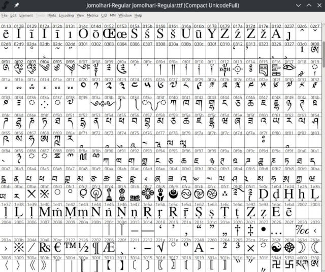
The Unicode code page for Tibetan: 0x0F00 - 0x0FFF[1]#
0 |
1 |
2 |
3 |
4 |
5 |
6 |
7 |
8 |
9 |
A |
B |
C |
D |
E |
F |
|
|---|---|---|---|---|---|---|---|---|---|---|---|---|---|---|---|---|
U+0F0x |
ༀ |
༁ |
༂ |
༃ |
༄ |
༅ |
༆ |
༇ |
༈ |
༉ |
༊ |
་ |
༌\(_{\tiny{NB}}\) |
། |
༎ |
༏ |
U+0F1x |
༐ |
༑ |
༒ |
༓ |
༔ |
༕ |
༖ |
༗ |
༘ |
༙ |
༚ |
༛ |
༜ |
༝ |
༞ |
༟ |
U+0F2x |
༠ |
༡ |
༢ |
༣ |
༤ |
༥ |
༦ |
༧ |
༨ |
༩ |
༪ |
༫ |
༬ |
༭ |
༮ |
༯ |
U+0F3x |
༰ |
༱ |
༲ |
༳ |
༴ |
༵ |
༶ |
༷ |
༸ |
༹ |
༺ |
༻ |
༼ |
༽ |
༾ |
༿ |
U+0F4x |
ཀ |
ཁ |
ག |
གྷ |
ང |
ཅ |
ཆ |
ཇ |
ཉ |
ཊ |
ཋ |
ཌ |
ཌྷ |
ཎ |
ཏ |
|
U+0F5x |
ཐ |
ད |
དྷ |
ན |
པ |
ཕ |
བ |
བྷ |
མ |
ཙ |
ཚ |
ཛ |
ཛྷ |
ཝ |
ཞ |
ཟ |
U+0F6x |
འ |
ཡ |
ར |
ལ |
ཤ |
ཥ |
ས |
ཧ |
ཨ |
ཀྵ |
ཪ |
ཫ |
ཬ |
|||
U+0F7x |
ཱ |
ི |
ཱི |
ུ |
ཱུ |
ྲྀ |
ཷ |
ླྀ |
ཹ |
ེ |
ཻ |
ོ |
ཽ |
ཾ |
ཿ |
|
U+0F8x |
ྀ |
ཱྀ |
ྂ |
ྃ |
྄ |
྅ |
྆ |
྇ |
ྈ |
ྉ |
ྊ |
ྋ |
ྌ |
ྍ |
ྎ |
ྏ |
U+0F9x |
ྐ |
ྑ |
ྒ |
ྒྷ |
ྔ |
ྕ |
ྖ |
ྗ |
ྙ |
ྚ |
ྛ |
ྜ |
ྜྷ |
ྞ |
ྟ |
|
U+0FAx |
ྠ |
ྡ |
ྡྷ |
ྣ |
ྤ |
ྥ |
ྦ |
ྦྷ |
ྨ |
ྩ |
ྪ |
ྫ |
ྫྷ |
ྭ |
ྮ |
ྯ |
U+0FBx |
ྰ |
ྱ |
ྲ |
ླ |
ྴ |
ྵ |
ྶ |
ྷ |
ྸ |
ྐྵ |
ྺ |
ྻ |
ྼ |
྾ |
྿ |
|
U+0FCx |
࿀ |
࿁ |
࿂ |
࿃ |
࿄ |
࿅ |
࿆ |
࿇ |
࿈ |
࿉ |
࿊ |
࿋ |
࿌ |
࿎ |
࿏ |
|
U+0FDx |
࿐ |
࿑ |
࿒ |
࿓ |
࿔ |
࿕ |
࿖ |
࿗ |
࿘ |
࿙ |
࿚ |
|||||
U+0FEx |
||||||||||||||||
U+0FFx |
Looking at the Unicode table one notices that all Tibetan letters are contained in it, and they are all contained twice, e.g. ཀ (at position U+0F40) and ྐ (at position U+0F90). The second variant is used to construct compounded stacks, e.g. གྱི, which is a sequence of Unicode characters ག, ྱ, ི, or U+0F41,U+0FB1,U+0F72. The circles simply indicate, if the subsequent glyphs are ‘pasted’ below (as in ྱ) or above (as in ི).
Encoding glyphs#
A Tibetan font contains two major areas:
First, it contains all the glyphs defined by the Unicode Tibetan table as shown in the table above. An example for such a standard entry would be
ག.Secondly, it needs to contain a ligature table, containing the glyphs and an OpenType descriptions for each glyph for any possible Tibetan stack. So there needs to be a glyph for
གི,གྱ,གྱིand so on. Every single possible stack needs to be designed and included into the font. Due to the multiple different use-cases of Tibetan for Sanskrit transliteration (mantras, e.g.ཧྲཱིཿ), Chinese transliteration and Dzongkha shorthand contractions[2] (e.g.དཀོོག་forདཀོན་མཆོག་), the number of possible stacks is basically unlimited.
Example: Jomolhari and FontForge#
To learn more about the encoding and creation of Tibetan fonts, is best to look at an example. Download:
FontForge, a powerful free and open font editor that can be used to extend existing Tibetan fonts or create new ones. It available for Linux, macOS and Windows.
Checkout the FontForge tutorial to get an overview of the programs capabilities.
Now start FontForge and open Jomolhari-Regular.ttf.
Once Jomolhari is loaded, select Encoding / Compact (hide unused glyphs) to make navigation easier.
Then select View / Label glyph by / Unicode. That will display the numeric code (the Unicode value) of each glyph above it’s graphical representation. This code is later required in order to construct new Tibetan stacks or ligatures.
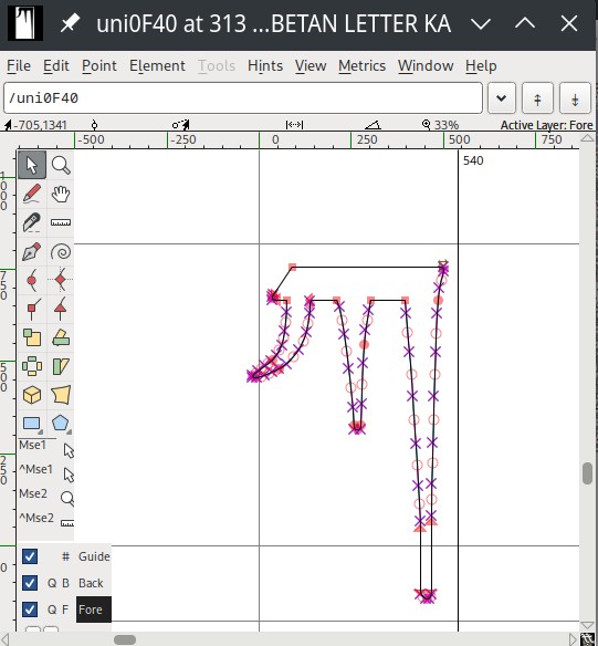
Double-click ཀ at Unicode value 0F40, and a vector-graphics editor for the ཀ-glyph will open. Each glyph in the Unicode table for Tibetan is defined by a vector outline.
Let’s look at compound stacks, so called ligatures. We will again look at the example of གྱི.
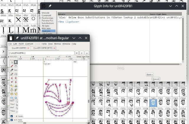
First, scroll down to position f360. It contains the glyph གྱ, the intermediate between ག and གྱི. Double-click the glyph to open the outline editor: this specific glyph had to be designed using vector graphics, since both letters merge organically. In the outline editor window of གྱ, select Element / Glyph info, and Ligatures. This describes the OpenType rules, how the glyph གྱ is composed of the two unicode characters ག (at U+0F41) and ྱ (at U+0FB1): the ligature is a blws ‘Below Base Substitution’ which means a གྱ is composed of a ག with subjoined ྱ.
To learn more about FontForge’s ligatures check out the ligature documentation.
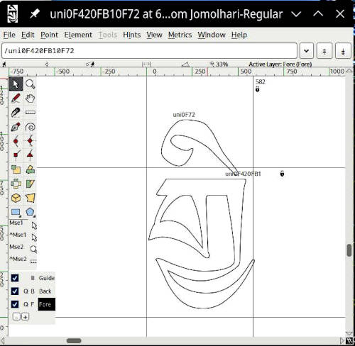
The next position f361 contains གྱི. Again open the outline editor. གྱི is composed as references to two existing glyphs: གྱ and ི. Since the two glyphs are not morphed together, no vector-graphics-editing is needed to compose གྱི from it’s two components that are referenced by their corresponding glyph-names: uni0F72 and uni0F420FB1. Those names were originally chosen by the creator of the font. FontForge simply stores the relative positioning of the two referenced glyphs in order to synthesize the compound གྱི.
Before you start modifying a given font, it is good practice to look at many different glyphs and learn which OpenType features are used to describe ligatures.
Some general hints and advice on potential pitfalls:
Using the vector graph editor to generate new glyphs is art work. It’s very helpful to have a reference calligraphy available as ground truth. Each calligrapher has their own subtle style of how to join and merge stacks and where to align vowel marks. External vector editors (e.g. Inkscape) can be used and the result can be imported into FontForge.
Usually, ligatures are not stored within the Unicode code range. Jomolhari follows an old, outdated standard that uses a specific Unicode range (the private use area, here
f3xx) to store some of the more commonly used glyphs. This was important at times where OpenType features didn’t work on all platforms and programs, in order to achieve greater compatibility. This is no longer a concern. See Extension A for more details.Some OpenType ligature descriptors are sometimes used interchangeably, e.g.
blwsandabvs(below- and above substitution), which in most cases works fine. It’s best to learn from a given font’s existing ligatures which conventions are being followed. Note that Western ligatures (mostly by convention) use different OpenType ligature classes, so what you might encounter in ligature tutorials might not directly map to Tibetan. Again it is best to use FontForge to examine existing Tibetan FontsEspecially when creating fonts from scratch, extensive testing on different operating systems and with different applications and web browsers is required to make sure that Tibetan stacks are rendered correctly. Situation with compatibility has very much improved during the last decade of Unicode development, but there are still surprises. An example is
ཨཱརྻwhich renders incorrectly with Jomolhari on macOS and correctly on other operating systems. In order to find out what goes wrong, it might be necessary to look at the ligature-definitions of different fonts to narrow down the problems.Avoid using fonts that do not have an open license. During any serious work, you’ll encounter the case that you need a certain Tibetan stack (e.g. an uncommon mantra) that isn’t rendered correctly with your favorite font. In that case you have two possibilities: contacting the authors of the font for support, or to modify the font yourself. In both cases you would end up with a custom font that you only can distribute, if the the font uses an open license. So avoid to lock yourself in with proprietary fonts. Examples of fonts that are both well supported and have an open license are Google’s Noto fonts and the Babelstone fonts. See Tibetan fonts for more information.